Forecast
Forecast is a long-form generative art project coming to fxhash on 16th Feb 2023. This article contains info about techniques I used, and some rambling about concepts and emotions.
You can see the project live on fxhash here and explore the variations before it drops.
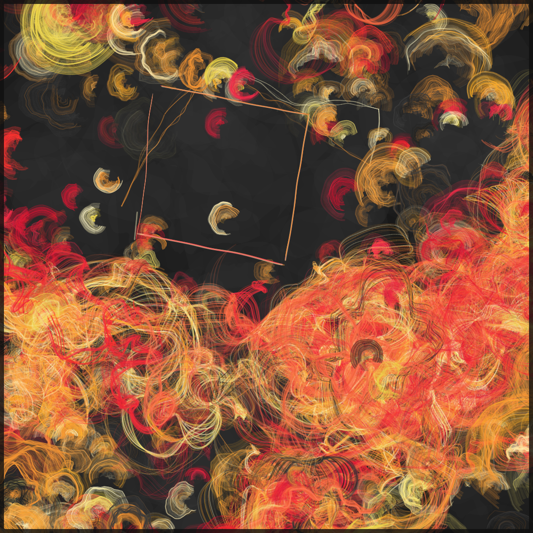
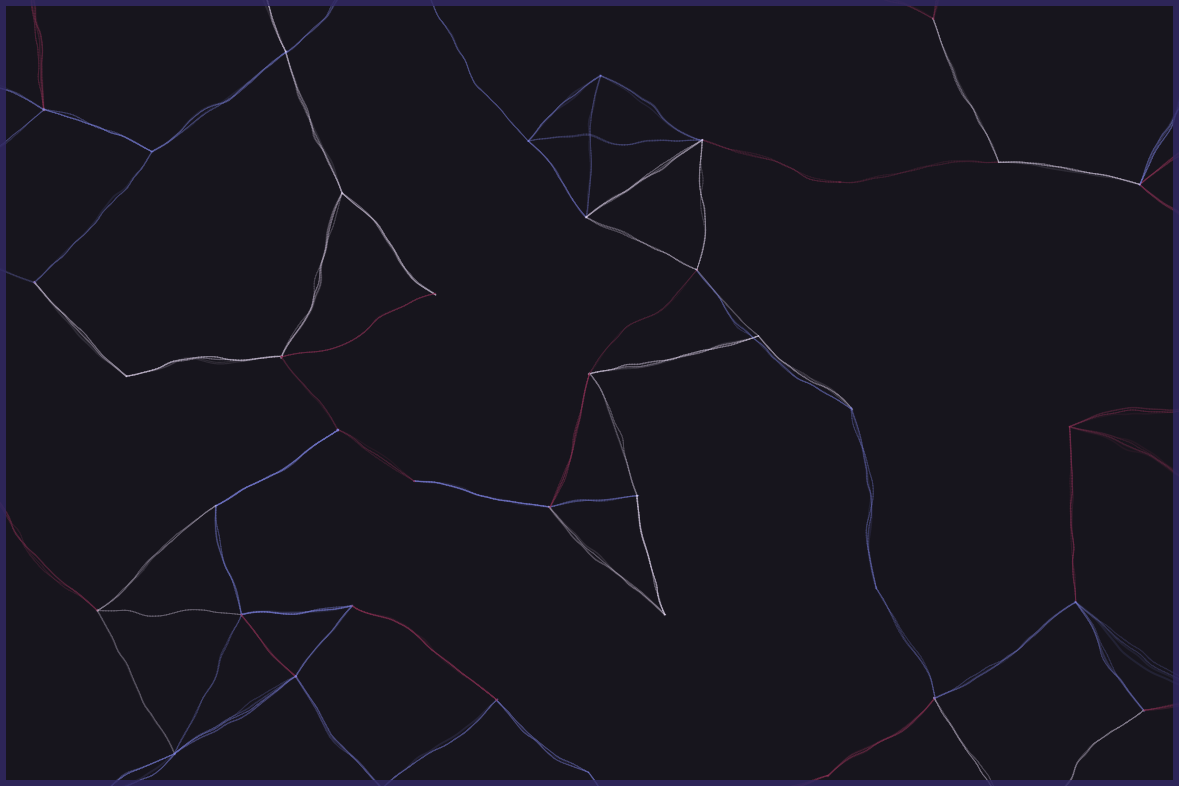
Forecast example output
Forecast example output

Forecast example output

Forecast example output
Art ex machina
When early generative artist Manfred Mohr began making art with a computer, his initial goal was to recreate his painting style. The first image below is a painting of his and the second is an early plotted drawing.

Painting: Bild 251/66 (1966) Manfred Mohr
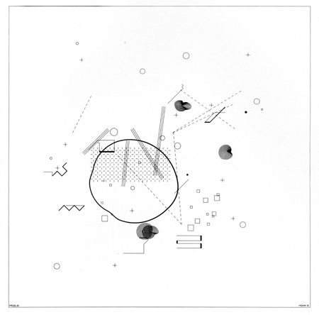
Plotted drawing: P-61, "geometric hints" (1970) Manfred Mohr
A few years later, Mohr wrote an article about his explorations and said that he had found “a surprisingly large amount of regularities” in his paintings and that he was able to create a “rudimentary syntax” of the “basic elements” of his work.
He stressed that computers should not be viewed only as interpreters of “old techniques of drawing and imagination” but rather should develop their own vocabulary in creating aesthetic systems through the use of algorithms, randomness and dialogue with artists.

P-197 (1977) Manfred Mohr
Mohr’s later computer work brings the algorithm to the foreground, as he was keen for the “logic of the events to become perceptible.” Much early generative art takes this approach, clearly displaying the presence of an algorithm, as if to educate the viewer about the potential of computing in art.
I’m keen to return to Mohr’s earlier thoughts though - where he investigated his paintings and sought to develop algorithms to recreate them.
Art ex algorithm
I’m curious whether traditional abstract painters ever feel like they are executing algorithms. Almost certainly they will have some “rules” they impose internally. Perhaps strict ones like, “any large focal element should be placed above the centre on a square canvas” or more general thoughts like, “when it’s all looking a bit horizontal, make it more vertical.”
I’ve been watching Sophie Tea painting on TikTok and she often casually mentions intuitive rules and refers to various recurring elements of her paintings by name, such as “pachows” and “kebabs” - much like the ones that Mohr discovered in his work.
In general actually, I think a lot about how much of our behaviour is determined by or could be recreated by algorithms. I’ll just leave that there but I do touch on it more in this article about emergence.
What I’m getting at here…
With Forecast, I developed an algorithmic system for abstract paintings featuring a library of elements. My focus was not the visibility of the algorithm in the final result, but I enjoy that the presence of it is perceptible. Instead, my focus was leveraging the power of algorithms to produce aesthetically and emotionally impactful images.

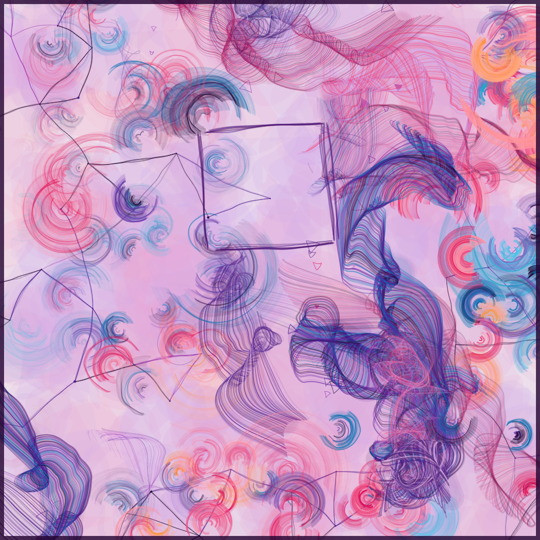
Forecast example output

Forecast example output

Forecast example output
In terms of that emotional impact, I will talk a bit about the thoughts I had while creating Forecast although it’s not important to me if the work puts you in mind of the same sorts of thoughts. I am happy with whatever my art communicates to the audience, but here’s what it is for me.
In October my mum had a stroke and I have temporarily moved away from my usual life to be nearby. I share those facts of the situation partly just to avoid being mysterious. The point is that it really sucks and that as I made Forecast, two themes emerged.
The first is present in the title. I am currently consumed with speculation on the near and distant future, making plans based on unreliable predictions. The outputs remind me of weather maps and contain constellations. I’ve long been sceptical of weather forecasting (kind of as a running joke) and I don’t believe in horoscopes. Something in the images suggests to me maps, guides or even instructions but in fact there’s none of that and more predominantly, they contain chaos.
The second theme is something about beauty, meaning and making the best of things. I occasionally wondered whether to make this series feel “darker”, to communicate how shit things are. That thought doesn’t stay for long. I am more consistently preoccupied with making things more beautiful. What can I do to make it better, what can do I that might turn it all around… what could make it okay? I just want everyone to have a nice time.

Forecast example output
Elements
There are six elements in Forecast, lets go through each one and then I’ll talk a bit about the system for placing them on the canvas.
Background daubs
The most simple element is 400 low opacity polygons which add background texture. Some have jaggy edges and some are rounded.


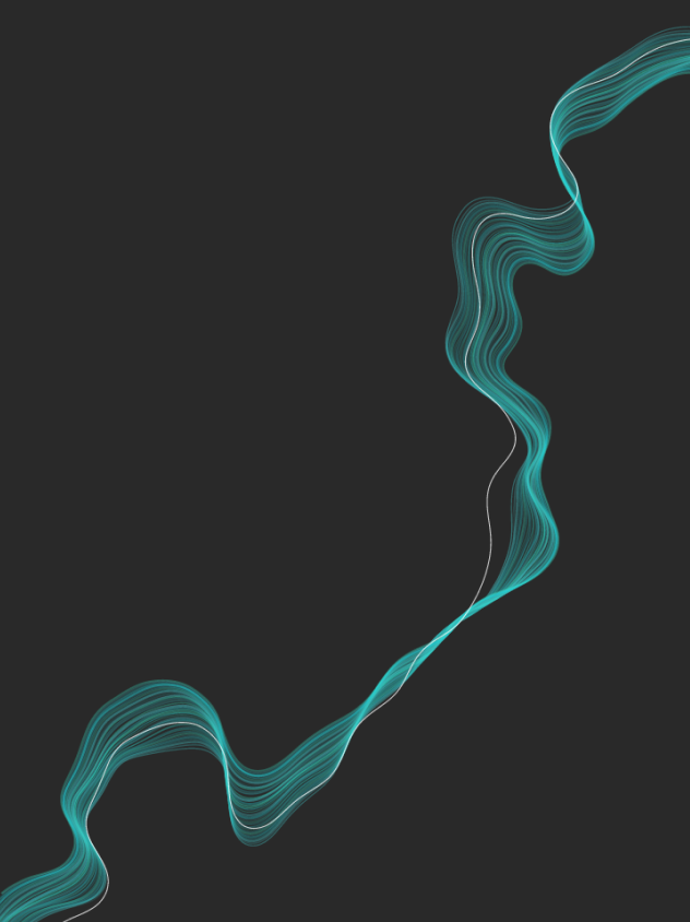
Swoops
I developed this element in November 2022, partly based on the ensō that I made during Genuary 2021. I wanted it to be like a swooshy tight brush stroke - more full than an ensō. I also found a bold graphical result along the way, maybe that will crop up again somewhere one day.

Day 13 Genuary 2021

WIP

WIP
For eye candy here are some versions of large swoops on their own. You can see some of the variety available in these elements, which is mostly related to how wibbly they are.

WIP

WIP
And here’s how a canvas full of them looks.

WIP
It’s possible for the size and opacity of swoops to be determined by their position, producing results like these -

WIP - Swoop size adjusted by distance from centre of canvas

WIP - Swoop opacity adjusted by vertical position
Paint
This element has been on quite a journey during development. The idea was to create something inspired by painted brushstrokes. I started by using a flow field to create a “master path” for each brush stroke. Different settings for the flow field create varied results.

WIP - Paint master paths

WIP - Paint master paths
Each master path is then duplicated, to create brushstrokes. I laid the additional paths next to the original, with every new point positioned at a right angle to the original point’s heading. This is simple when the master path is smooth as in the first image below but in the second image the path contains tight turns where the brushstroke paths cross over themselves. (In all these images the master path is in white and the brush paths are green).
This is the same challenge that I explored in this blog post about expanding borders around polygons. I tried out the methodologies from that post to eliminate the problem but none of them are perfect, and they are computationally heavy, so ultimately I didn’t use them this time.
Instead, I developed a slightly different method of duplicating the paths using angles that varied with Perlin noise. This method can be seen in the third image below.

WIP - brush paths added to smooth master path

WIP - brush paths added to wobbly master path

WIP - brush paths added using smooth angles
Next there is a “jitter” step, where the paths of the brushstrokes are adjusted further, again using Perlin noise. Adjusting parameters like the number of brushstroke paths, the distance at which they are extruded and the resolution of the various Perlin noise fields creates varied results.
WIP - jitter added to brush paths

WIP - jitter added to brush paths

WIP - jitter added to brush paths
I found that the jitter step creates enough movement that I could use the original extrusion method as well. In the two images below you can see how the “crossover” areas look blocky and awkward before the jitter is added, but with the jitter it creates a natural flowy effect.


There are a lot of settings to adjust here to create different results and usually in that situation, I would mix and match them, generating lots of variety. In this case, each setting effects the others a lot and some combinations created unwanted results, so I created nine “sets” of settings for nine different types of brushstrokes.

WIP - “smooth wide” paint

WIP - “wispy” paint

WIP - “tight wisps” paint

WIP - “slender” paint

WIP - “mixed spirals” paint

WIP - “loose spirals” paint

WIP - “messy” paint

WIP - “scribble” paint

WIP - “ripple” paint
Triangles
Nice and simple - they’re triangles! I wibbled the paths a bit so they look more hand drawn.

Constellations
Constellations are created by placing nodes with a simple packing algorithm that ensures they’re not too close to each other. Each node is connected to its nearest neighbours. Each connection is drawn several times, with Perlin noise being used to jitter the paths and make them look hand drawn.
There are 4 different options for constellations, varying the distance between the nodes and the number of connections each has. The fourth option is “mixed”, meaning the distance between the nodes varies across the canvas.

WIP - “network” constellation

WIP - “medium” constellation
WIP - “distant” constellation

WIP - “mixed” constellation
Overlay shapes
It’s possible for there to be 0, 1, 2 or 3 large shapes to draw focus in the composition. Once again I used Perlin noise to create a hand drawn sketchy effect with these shapes.
WIP - overlay shapes

WIP - overlay shapes

WIP - overlay shapes
Some other elements get removed or lowered in opacity if they land inside the overlay shapes, to create focus inside the shapes. Other elements aren’t always completely removed, so the influence and boldness of the overlay shapes varies.

Forecast example output

Forecast example output
Composition
If I was to drop all of these elements on the canvas wherever, we would get results like this:

WIP - uncomposed example

WIP - uncomposed example
All of the elements got lost in amongst each other and there’s no variation or composition across the canvas.
I could have developed a packing algorithm that stopped elements from being placed directly on top of each other, but this approach has two issues. Firstly with so many different elements we would need lots of different types of checks, and secondly I didn’t want the elements to not overlap at all.
Instead, I used a noise field (it’s noise fields all the way down) to place elements. Each element is given part of the range from 0..1 and instances of the element are only placed where the noise result for that area is within the range.
Because noise results do not evenly distribute from 0..1, the canvas is first analysed to see the range of results present and the ranges adjusted accordingly. For example, this one has results from 0.13 to 0.82 and
constellation nodes appear in range 0.13 - 0.43
swoops appear in range 0.26 - 0.47
paint appears in range 0.43 - 0.67
triangles appear in 0.56 - 0.82

Debug view showing composition noise field
I have 6 different options for assigning the noise field ranges to lay out the elements.

Forecast example output - “varied” composition

Forecast example output - “triangle takeover” composition

Forecast example output - “space” composition

Forecast example output - “swoop takeover” composition

Forecast example output - “constellation takeover” composition

Forecast example output - “desolate” composition
The bit at the end
I like to think there’s a lot here that aligns with Mohr’s idea that the computer is not simply an interpreter but rather that it should use it’s own vocabulary and play to its strengths.
In many places I was inspired by a traditional painting method but the results are shaped by the nature of the mathematical and computational methods used. When comparing the noise field composition technique to the way a traditional artist lays out elements on a canvas, there are similarities and differences.
I particularly enjoy how often things look quite deliberate and purposely placed. For example, the overlay shapes seem to be drawing attention to a particular part of the canvas as if by design, when in fact it is random.
Overall, I am SUPER happy with how this turned out. Like I mentioned, I am having a proper shit time of it at the moment and this project has been the one thing distracting me from that. I hope you enjoy it.
Drop details
Thurs 16th Feb @ 18h UTC
256 editions, DA 96 -> 20tz
Allow list for collectors who own 5+ of my fxhash pieces, now finalised, will close after 24hrs.
You can see the project live on fxhash here and explore the variations before it drops.
