Curved Line Jellyfish
The idea
My plan was to create a circle of points each connected to the one opposite by a curved line. Each point would also have an “anchor point” which defines the shape of the curve. I imagined the anchors would be slightly outside the main circle of points, and offset by around -30 to 30 degrees.
I had pictured something quite bold, graphical and geometric but I ended with gradients and floatiness.
curves across a circle of points
The first thing I did is code up the idea exactly as described above.
The first image is the result - showing curved lines going from point to point. In the second image, to give more of an idea of what is going on, I also drew the location of the anchors, connected to their main point.

fine-tuning the curves
The first thing I noticed is that the lines weren’t anywhere near as curved as I’d imagined them being, even when the angle of the anchor point is offset quite far from the angle of its main point.
I hadn’t used the curve() function in p5js very much, so I did some experimenting to figure out how to make the curves more curvy.
To see clearly, I drew just one line and moved an anchor point around with the mouse (first animation below), No matter where on the canvas the mouse is, the line is never very curved. It turns out that to create properly curvy curves in p5js, the anchor points need to be quite distant in relation to the length of the curve itself (second animation below).


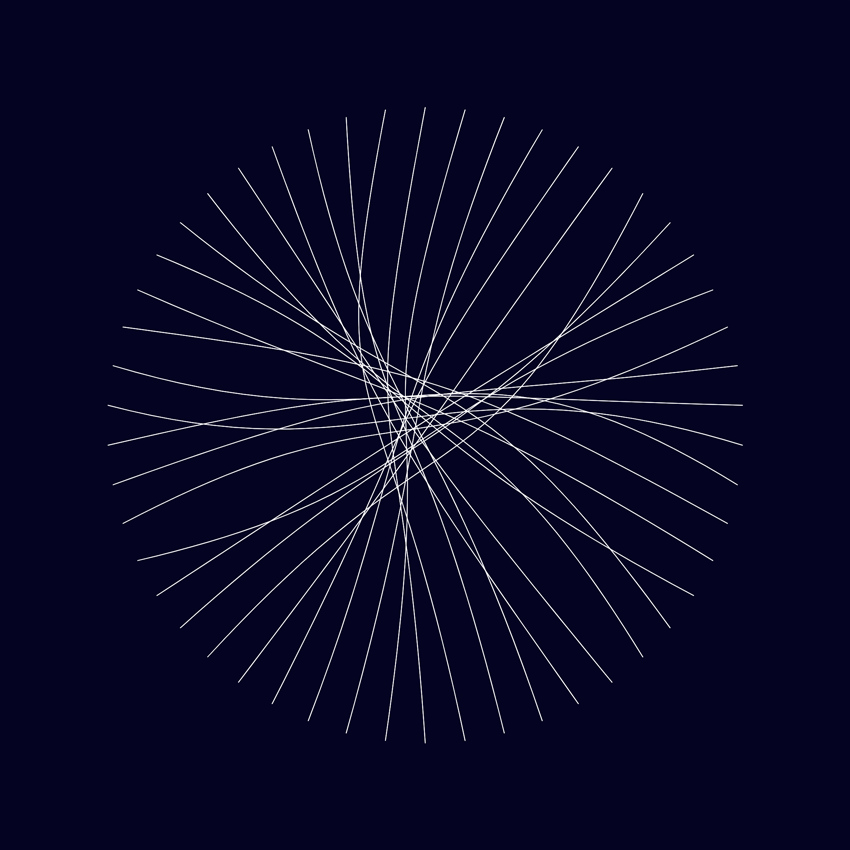
I went back to 50 points in the circle, and moved the anchor points much further away (between 600 - 3000 pixels).
The images below show the results, with much more pronounced curves. In the first image, the anchor points are now far off the edge of the canvas. The second image is essentially a zoomed-out view, with a smaller circle of points, creating room to show the locations of the anchor points.

To recap…
The position of the main points is defined by a distance from the centre of the circle, and an angle in relation to the centre of the circle. The distance is always the same (i.e. the radius of the circle), and the angle increments steadily around the circle i.e. since there are 50 points, each point is 360°/50 = 7.2° apart.
The position of the anchor points is defined with an additional distance from the centre of the circle (from 600-3000px extra), and the angle is offset by up to 40° either side of the main point’s angle.
In the examples above, the additional distance and the angle offset is chosen completely randomly for each anchor point, giving somewhat frenetic results.
less random, more noisy
Whenever there is randomness… there could be Perlin noise.
My next step was to use Perlin noise to generate the angles and distances for the anchor points for smoother results..
Again, here is one image showing the results and one with a ‘zoomed out’ version to show the anchor point locations.


You can see now that each line has a similarity to its neighbour, and the differences are smooth as we go around the circle.
RAMP IT UP
So far, these are pretty much the results I was planning - with visible individual lines curved across the circle.
At this point though, you might be starting to see how this collection of curved lines ends up resulting in the jellyfish-esque image in the header. If not, let me show you!
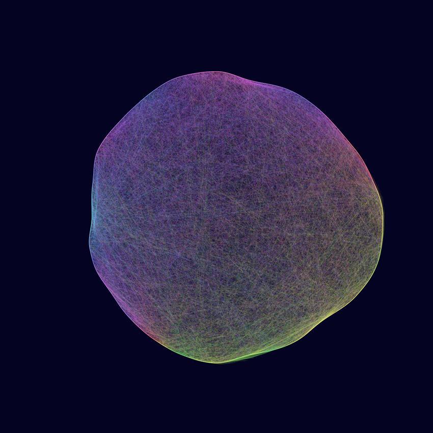
By increasing the number of lines, and lowering the opacity of each line, it’s possible to create smooth, ribbony, graduated areas of opacity where the lines overlap.
(I used a similar technique recently in my Twisted Ribbons.)
Here are some results…
(click to expand)
I don’t know about you, but I absolutely love these.
When originally coding all this, I didn’t quite get to images exactly like these before moving on to the next ideas (colour, animation, etc). It’s only in coming back to retrace my steps for this blog post that I had the code (and my understanding) in a place where I could adjust the parameters to get these. Another win for writing up my work.
More organic
Looking at the images above now, I very much like the balance of geometric perfection in the outer circle and floatiness in the curves but, at the time, I remember wanting to break apart the ‘perfect’ circle of the outline to match the organic curves inside.
I used Perlin noise again to adjust the main points’ distance from the centre of the circle.
That brings us to these…


COLOUR
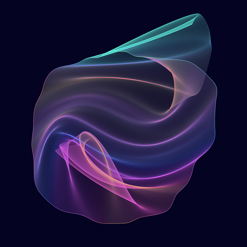
When I originally made these, the next thing I did was introduce animation but, while writing this post, I added colour to these still versions instead.
I used Perlin noise (again) to adjust the hue across a range between a minimum and maximum value.
I also added a line around the edge (each point connects directly to its neighbour) for some definition - I actually think this simple addition makes a big difference in some of these, really bringing them alive.


Guhhhhh. I cannot. 🤤😍

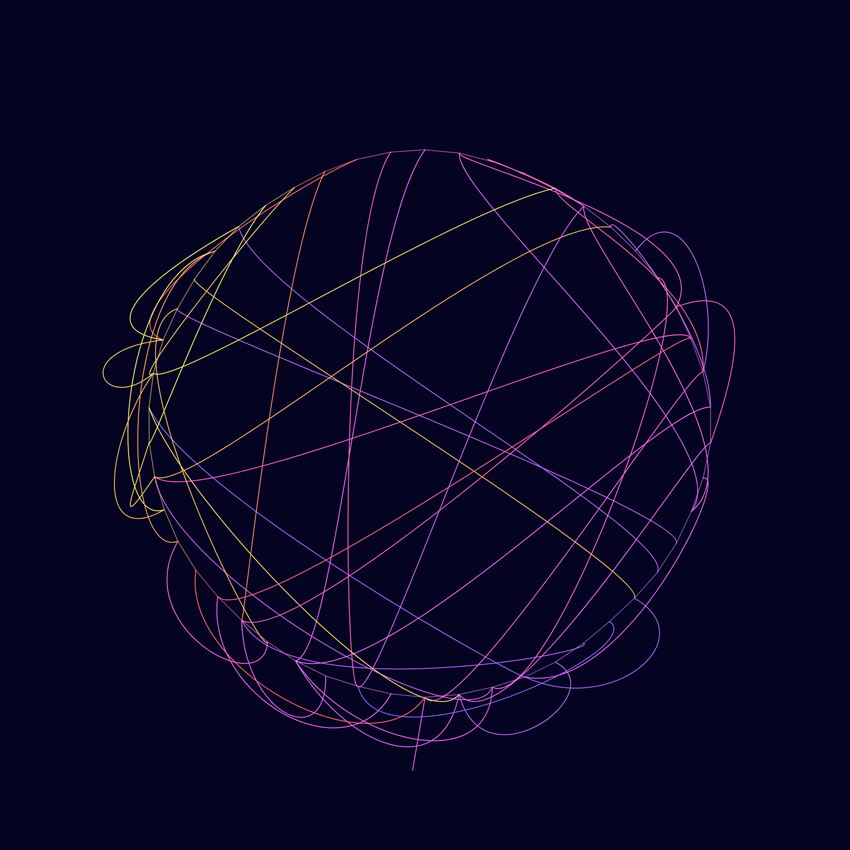
Different Connections
At this point I wanted to see if I could remove the frequent “star” pattern that appears in the middle of these. It doesn’t always show up, and different variables make it more/less likely, but it’s caused by the fact that all of the curves are crossing over each other in the middle of the shape to get to the other side.
I tried connecting the points with some different methods to get some alternative results. I’ve generated these with fewer lines and reduced the curviness of the lines, so you can see what’s going on. In the first image below, the points are connected to the one horizontally opposite and in the second, each point has a random partner.

(I did also experiment with choosing the pair using Perlin noise, but I haven’t been very happy with the results so far, so I haven’t included it.)
Let’s look at the random method first. It produces very different results because the reintroduction of complete randomness (as opposed to Perlin noise) removes some of the cohesion. They’re not completely without structure though, because the trajectories the lines set off in, and the colour of them are still controlled by noise, so they avoid being complete scribbles and are still quite beautiful, I think.


And lastly, the horizontally connected images…


Onwards
I had hoped to include animation in this blog post as well, but it is already quite long, and I am suffering a bit from covid vaccine side-effects (nothing too bad!) so I will leave it here and write about animation in a future post or get completely distracted by a new idea and you’ll never hear about this again.
Hope you enjoyed this post, please do feel free to leave any questions or feedback below and follow me on Instagram for more.